Joining #TidyTuesday
Every Tuesday, I often see submissions from the #rstats community on twitter about their #TidyTuesday projects. #TidyTuesdays are weekly data projects posted online by the R4DS (R for Data Science) community for anyone interested in working on developing their skills wrangling data within the R ecosystem. Feel free to check out the #tidytuesday repository on github for more information.
I felt it would be only natural for my first post to be joining this community and moving from being an observer to a participant. The data posted this week comes from city of Seattle.
Seattle Bike Counters
Background
“Seattle Department of Transportation has 12 bike counters (four of which also count pedestrians) located on neighborhood greenways, multi-use trails, at the Fremont Bridge and on SW Spokane Street. The counters are helping us create a ridership baseline in 2014 that can be used to assess future years and make sure our investments are helping us to reach our goal of quadrupling ridership by 2030. Read our Bicycle Master Plan to learn more about what Seattle is doing to create a citywide bicycle network.” Source
What are we working with?
Lets grab our data, and then take a quick look at it.
#load data
bike_traffic <- readr::read_csv("https://raw.githubusercontent.com/rfordatascience/tidytuesday/master/data/2019/2019-04-02/bike_traffic.csv", col_types = "cccnn")

#first six rows
head(bike_traffic)
## # A tibble: 6 x 5
## date crossing direction bike_count ped_count
## <chr> <chr> <chr> <dbl> <dbl>
## 1 01/01/2014 12:00… Broadway Cycle Track North O… North 0 NA
## 2 01/01/2014 01:00… Broadway Cycle Track North O… North 3 NA
## 3 01/01/2014 02:00… Broadway Cycle Track North O… North 0 NA
## 4 01/01/2014 03:00… Broadway Cycle Track North O… North 0 NA
## 5 01/01/2014 04:00… Broadway Cycle Track North O… North 0 NA
## 6 01/01/2014 05:00… Broadway Cycle Track North O… North 0 NAThe TidyTuesday repository also provides a “data dictionary” table in their repository that defines each variable so we can have a better understanding of what we are working. Instead of recreating it from scratch, I want to attempt to scrape the information from their github page. This might be overkill for a 6 X 3 table but I have recently stumbled upon Engaging the Web with R by Michael Clark. In it he demonstrated pulling data from a table found on Wikipedia. I was inspired to one day try it out myself and I think this is a great opportunity to implement it.
Web Scrape
Data Dictionary
Code
#load rvest package
library(rvest)

#Grab the link with the table you need
page <- 'https://github.com/rfordatascience/tidytuesday/tree/master/data/2019/2019-04-02'

#Use read_html to read the underlying html structure and objects found on the page
seattle_bikes <- read_html(page)

#Use html_table to pull all tables from page
dictionary <- html_table(seattle_bikes)

DT::datatable(dictionary[[2]],
              rownames = FALSE,
              options = list(dom = 't',
                             columnDefs = list(list(className = 'dt-left',
                                                    targets = 0:2))))
Back to Business
The data set we are working with includes a date and time of when data was collection, the location of the counter, the number of bikes and pedestrians crossing counter, and what direction they are heading.
While there are a lot of different analysis we can do with this data, for now I am going to just replicate some of the data visualizations composed the by Seattle Times about What we can learn from Seattle’s bike counter data. In their report, the Seattle Times disaggregated the data to see the average bike traffic across for each crossing during different time periods.
Before we clean up our data, I don’t know if you noticed but when I imported the data I manually entered the column types (except “date”, which we will fix later). When I ran the line of code as #TidyTuesday had posted, R was reading some of the columns incorrectly and returning values that I saw were highly skeptical (Good reminder always to check your raw data.).
For example, our ped_count was read as boolean and my values were either “NA”, “TRUE”, or “FALSE”. Our bike_count column was read as numeric but I was getting a count range from 0-8500. I don’t know about you, but this was a red flag for me. These bike counters are collecting counts at specific locations every hour. Trying to imagine that at 4:00 am on May 30, 2018 there were 8191 bikers crossing the South Burke Gilman Trail is a little humorous.
## # A tibble: 1 x 5
##   date                   crossing           direction bike_count ped_count
##   <chr>                  <chr>              <chr>          <dbl>     <dbl>
## 1 05/30/2018 04:00:00 AM Burke Gilman Trail South           8191       255
I think its fair to believe there are a couple of errors during data collection, but I’ve never been to Seattle so I could be wrong. While I suspect some errors, in this post I am not going to make any assumptions to filter the counts and will use the data as is. Additionally, this post is about data wrangling and replicating some data visualizations, not having the most accurate data. So lets begin setting up our data.
Setting Up Our Data
#load packages
library(tidyverse) #for dplyr, ggplot2, forcats packages
library(lubridate) #for easier work with date/times
library(cowplot) #for arranging our ggplots

#Time Interval
FY17_18 <- interval(mdy("5/1/2017"), mdy("4/30/2018"))

#Prep data
btraffic <- bike_traffic %>%
  mutate(date = mdy_hms(date)) %>% #fix date variable
  filter(date %within% FY17_18) %>% #latest full year of data
  mutate(
    mnth = factor(month(date), labels =  c(
    "January", "February", "March", "April", "May", "June", "July", "August",
    "September","October", "November",
    "December")),
    wkdy = factor(wday(date), labels =  c(
    "Sunday", "Monday", "Tuesday","Wednesday", "Thursday","Friday",
    "Saturday")),
    hrs = factor(hour(date))) #new time variables
Creating Plots
For each crossing we will have the average bike traffic by:
- By Year, May 2017 - April 2018
- By Week
- By Hour, During the Weekdays
- By Hour, During the Weekends
There are six crossings, therefore we will have 24 plots in total. To save us from writing out the code for each individual plot we will do the following: For each plot, we will first perform our specific aggregation. Second, split our data into a list of data frames grouped by crossing. Third, we will map our ggplot2 code onto our list. Fourth, we will place the output into its own object. This object will be a list of our ggplots which we will call later to sort all our plots by crossing.
#By Year
p.year <- btraffic %>%
  mutate(mnth = fct_relevel(mnth, c("May", "June", "July", "August",
    "September","October", "November", "December", "January", "February",
    "March", "April"))) %>%
  group_by(crossing, mnth) %>%
  summarise(average_bike_traffic = mean(bike_count, na.rm = TRUE)) %>%
  mutate(background = ifelse((as.numeric(mnth) %% 2) == 0, Inf, 0)) %>%
  split(.$crossing) %>%
  map(~ ggplot(., mapping = aes(mnth, average_bike_traffic, group = crossing)) +
        geom_bar(aes(mnth, background), stat = "identity", fill = "#e7e7e7",
             alpha = .4, na.rm = TRUE) +
        geom_path() +
        scale_x_discrete(labels = c("May", "Jun", "Jul", "Aug",
          "Sep","Oct", "Nov", "Dec", "Jan", "Feb", "Mar", "Apr")) +
        theme_minimal() +
        theme(line = element_blank(),
              axis.line.x = element_line(colour = "grey"),
              axis.text.y = element_blank(),
              axis.title.y = element_blank()) +
        labs(x = "Month",
             title = "May 2017 - April 2018"))

#By Day
p.week <- btraffic %>%
  group_by(crossing, wkdy) %>%
  summarise(average_bike_traffic = mean(bike_count, na.rm = TRUE)) %>%
  mutate(background = ifelse((as.numeric(wkdy) %% 2) == 0, Inf, 0)) %>%
  split(.$crossing) %>%
  map(~ ggplot(., mapping = aes(wkdy, average_bike_traffic, group = crossing)) +
        geom_bar(aes(wkdy, background), stat = "identity", fill = "#e7e7e7",
             alpha = .4, na.rm = TRUE) +
        geom_path() +
        scale_x_discrete(labels = c("Sun.", "", "","", "","", "Sat.")) +
        theme_minimal() +
        theme(line = element_blank(),
              axis.text.x = element_text(size = 14),
              axis.text.y = element_blank(),
              axis.title = element_blank()) +
        labs(title = "Weekly"))

#By Hour/Weekday
p.weekday <- btraffic %>%
  filter(between(as.numeric(wkdy), 2, 6)) %>%
  group_by(crossing, direction, hrs) %>%
  summarise(average_bike_traffic = mean(bike_count, na.rm = TRUE)) %>%
  mutate(background = ifelse(between(as.numeric(hrs), 10, 18), 0, Inf)) %>%
  split(.$crossing) %>%
  map(~ ggplot() +
        geom_rect(aes(xmin = 0, xmax = 9, ymin = -Inf, ymax = Inf),
                  fill = "grey", alpha = .5) +
        geom_rect(aes(xmin = 17, xmax = 23, ymin = -Inf, ymax = Inf),
                  fill = "grey", alpha = .5) +
        geom_path(., mapping = aes(as.numeric(hrs) - 1, average_bike_traffic,
                                   group = direction, color = direction)) +
        scale_x_continuous(breaks = c(0:23),
                           labels = c("", "", "", "", "", "", "", "", "",
                                      "9 a.m.", "", "", "", "", "", "", "",
                                      "5 p.m.", "", "", "", "", "", "")) +
        theme_minimal() +
        theme(line = element_blank(),
              axis.line.x = element_line(colour = "grey"),
              axis.ticks.x = element_line(colour = "grey"),
              axis.text.x = element_text(size = 12),
              axis.text.y = element_blank(),
              axis.title = element_blank()) +
        labs(title = "Weekdays, By the Hour"))

#By Hour/Weekend
p.weekend <- btraffic %>%
  filter(!between(as.numeric(wkdy), 2, 6)) %>%
  group_by(crossing, direction, hrs) %>%
  summarise(average_bike_traffic = mean(bike_count, na.rm = TRUE)) %>%
  mutate(background = ifelse(between(as.numeric(hrs), 10, 18), 0, Inf)) %>%
  split(.$crossing) %>%
  map(~ ggplot() +
        geom_rect(aes(xmin = 0, xmax = 9, ymin = -Inf, ymax = Inf),
                  fill = "grey", alpha = .5) +
        geom_rect(aes(xmin = 17, xmax = 23, ymin = -Inf, ymax = Inf),
                  fill = "grey", alpha = .5) +
        geom_path(., mapping = aes(as.numeric(hrs) - 1, average_bike_traffic,
                                   group = direction, color = direction)) +
        scale_x_continuous(breaks = c(0:23),
                           labels = c("", "", "", "", "", "", "", "", "",
                                      "9 a.m.", "", "", "", "", "", "", "",
                                      "5 p.m.", "", "", "", "", "", "")) +
        theme_minimal() +
        theme(line = element_blank(),
              axis.line.x = element_line(colour = "grey"),
              axis.ticks.x = element_line(colour = "grey"),
              axis.text.x = element_text(size = 12),
              axis.text.y = element_blank(),
              axis.title = element_blank()) +
        labs(title = "Weekend, By the Hour"))
Now that we have our plots, we have to arrange them together.
The code below are the steps used to sort our plots for each crossing but only one crossing, Broadway Cycle Track, is shown to save space in the post. The process is repeated for each crossing. The only difference is swapping out the crossing variables in our ggplot lists.
# title
grid_title <- ggdraw() + draw_label("Average Bike Traffic", fontface = "bold")

# 2X2 grid of plots
broadway <- plot_grid(
  p.year$`Broadway Cycle Track North Of E Union St`, # Replace variable "Broadway..." with another crossing for each ggplot2 list
  p.week$`Broadway Cycle Track North Of E Union St`,
  p.weekday$`Broadway Cycle Track North Of E Union St`,
  p.weekend$`Broadway Cycle Track North Of E Union St`,
  ncol = 2
)
# add the title to grid
plot_grid(grid_title, broadway, ncol = 1, rel_heights = c(0.1, 1))
Now we can sit back, view, and appreciate our plots for each crossing.
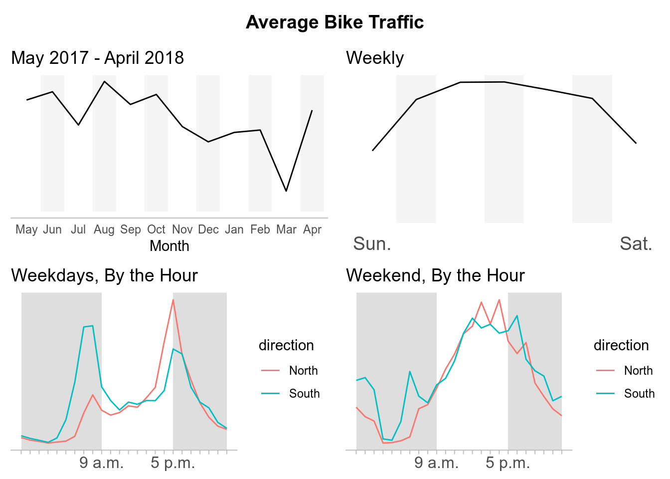
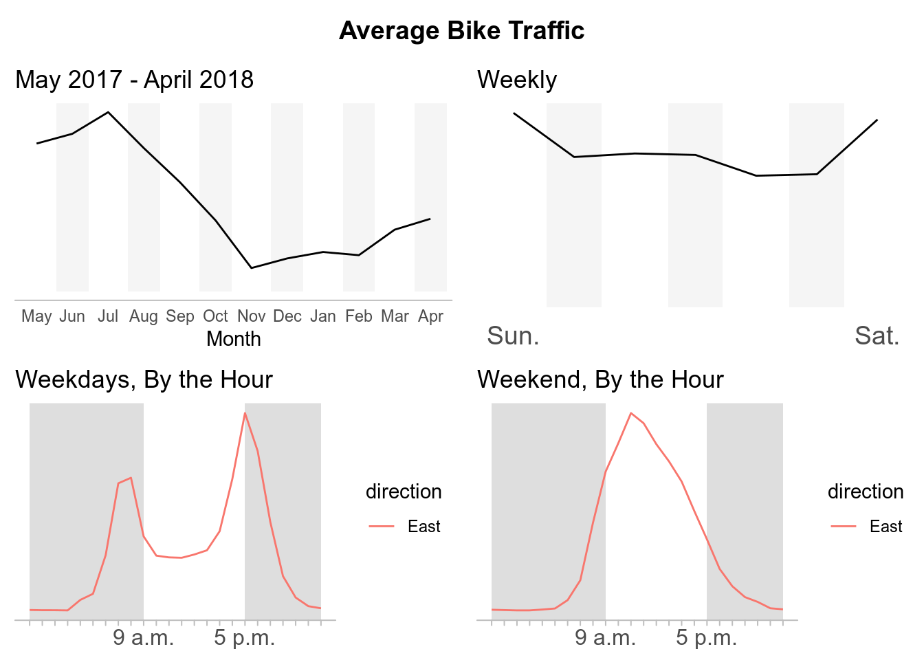
Broadway Cycle Track North Of E Union St
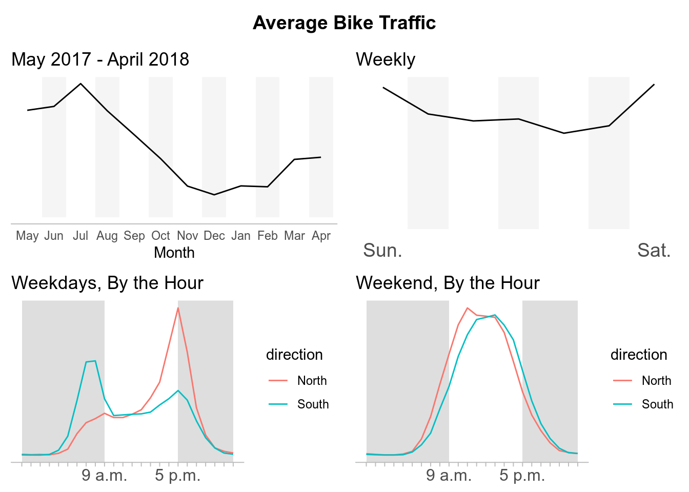
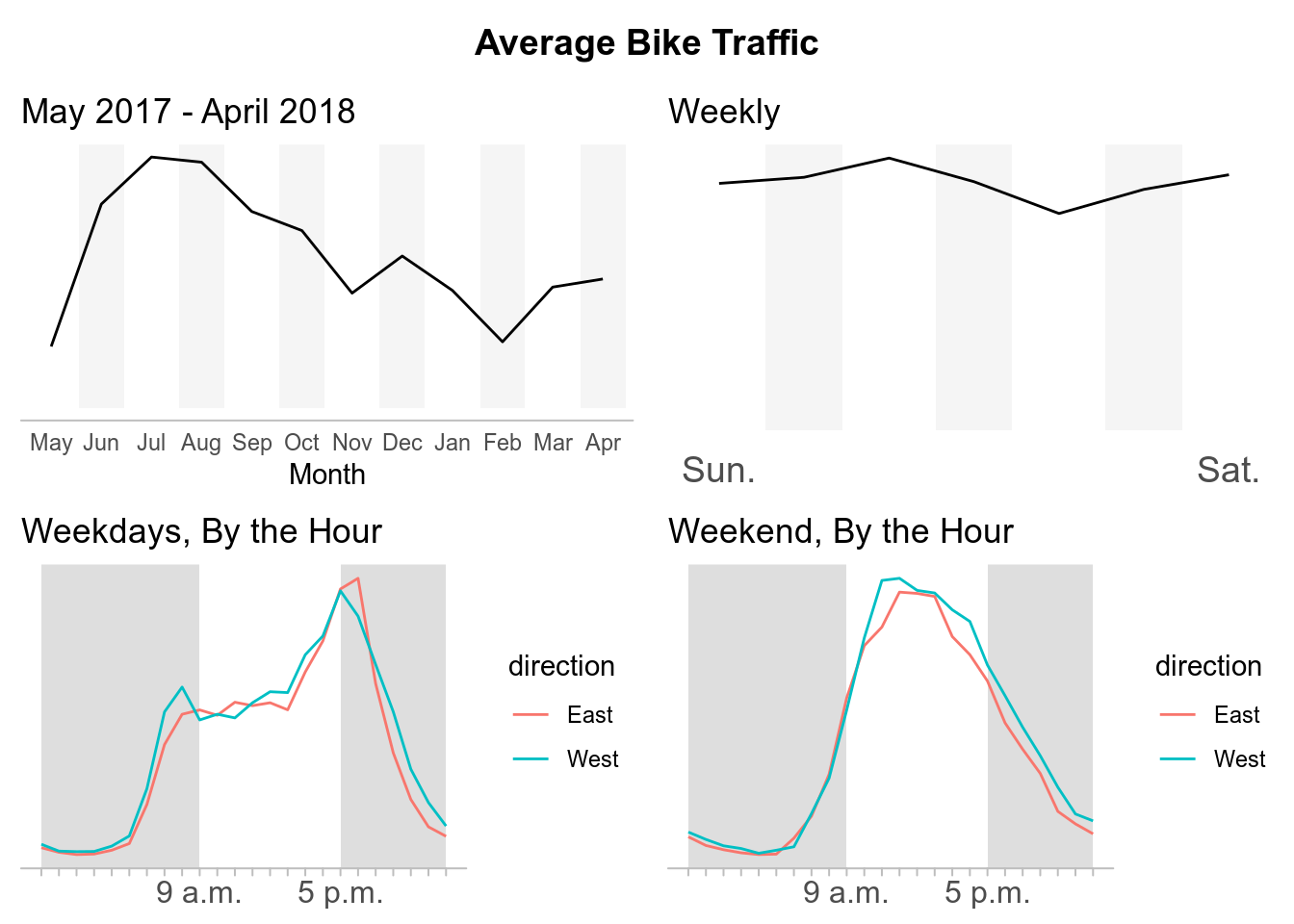
Burke Gilman Trail
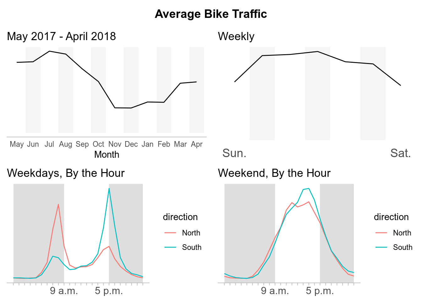
Elliot Bay Trail
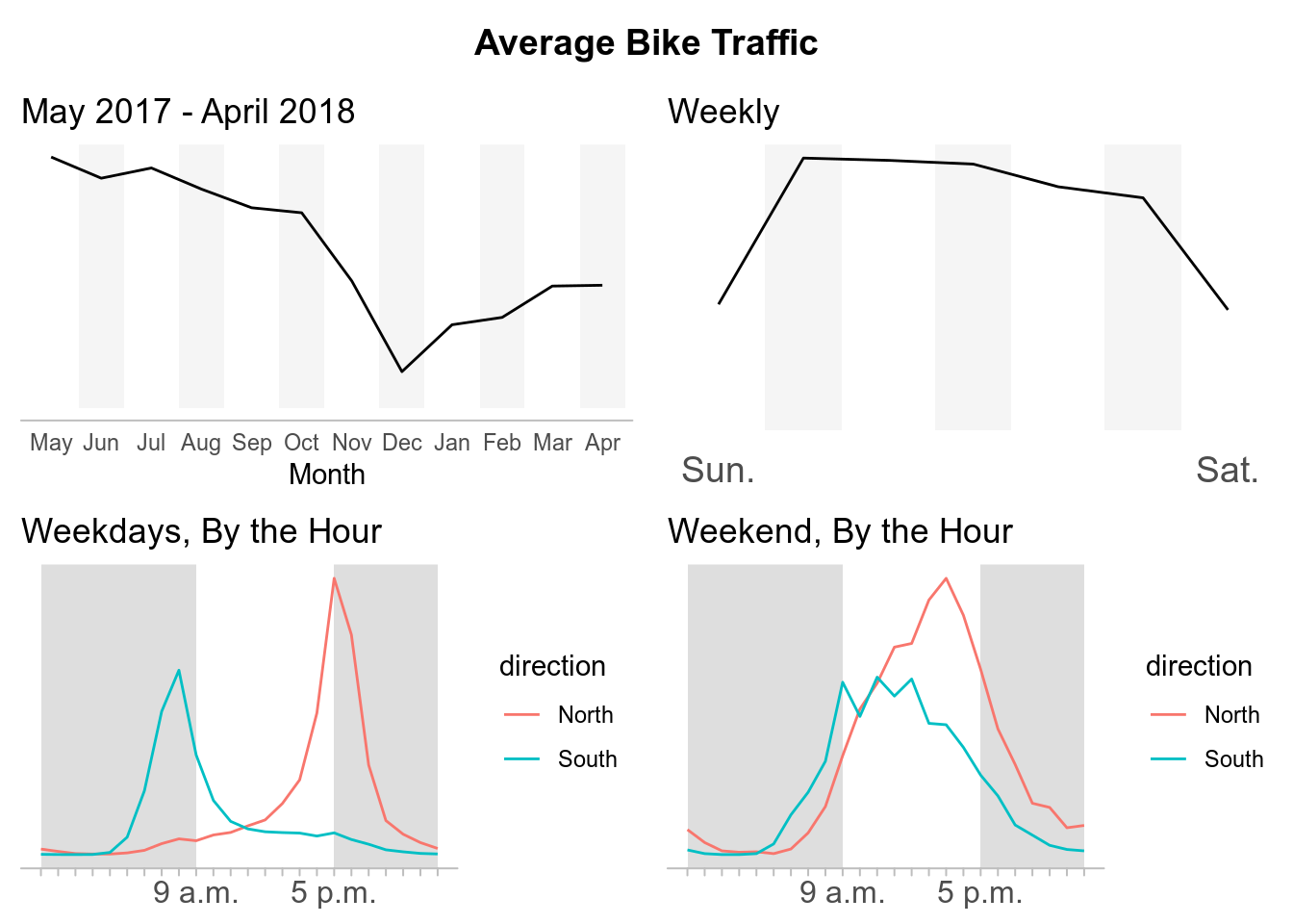
39th Ave NE Greenway at NE 62nd St
MTS Trail
NW 58th St Greenway at 22nd Ave
Final Thoughts
What this post accomplished:
- Served as an introduction for my first post on this site.
- Transitioned me from being an observer of #TidyTuesday into a participant.
- Allowed me to experiment and gain experience with web scraping data from webpages.
- Test my current ggplot capabilities to recreate data visualizations from a published news sources.
What I learned from this post:
- Writing this post took longer than I had originally anticipated.
- Ran into some conflicting formatting issues publishing this rmarkdown for this site compared to the everyday rmarkdown html template.
- Web scraping with rvest exposed me more to the back-end of web development.
- How to map ggplot2 onto a dataframe to create multiple plots that could be called individually later. Using the facet functions within ggplot2 would create the individual plots but I did not know how to seperate them to organize the plots by crossing instead of the ggplot object itself.
How I will be move forward:
- I will attempt to create more original content. My intentions for this post were simply to replicate the plots from Seattle Times article. However, I had issues with some of their formatting decisions. For example, they did not include numbers on their trend lines to have points of references for the average bike traffic which I also left out. (I recognize they include a description of peak bike crossings above the graphs, but in my opinion this is easy to overlook compared to when it is explicit on the plot itself.)
- Approach future posts with specific topics and not deviate. Looking back, I feel I got sidetracked by experimenting with web scraping. I want others and myself to be able to find and reference either ideas or code without wasting time trying to remember which post it was in.