MyAnimelist.net
This week TidyTuesday posted data from an anime and manga social networking and social cataloging website, MyAnimeList (MAL). This data will be interesting to examine because last summer I started watching anime shows and got hooked. I am a little embarrassed to admit it but I’ve seen a lot of different shows since then. I hope I get to find some new shows that I can watch later.
Data
Below are the different variables found within the dataset. There are a lot of different things we can look into but today we will be making graphs to visualize the most popular anime shows. The data has three different categories that I am interested in: popularity, favorities, and rank. Additionally, I wanted to demonstrate how easy it is to make dynamic plots out of static ggplots.
Load Packages
There are a few packages that I have also used but I did not want to load them all in my environment just for a few functions but they are: readr, lubridate, plotly, htmltools, and gridExtra.
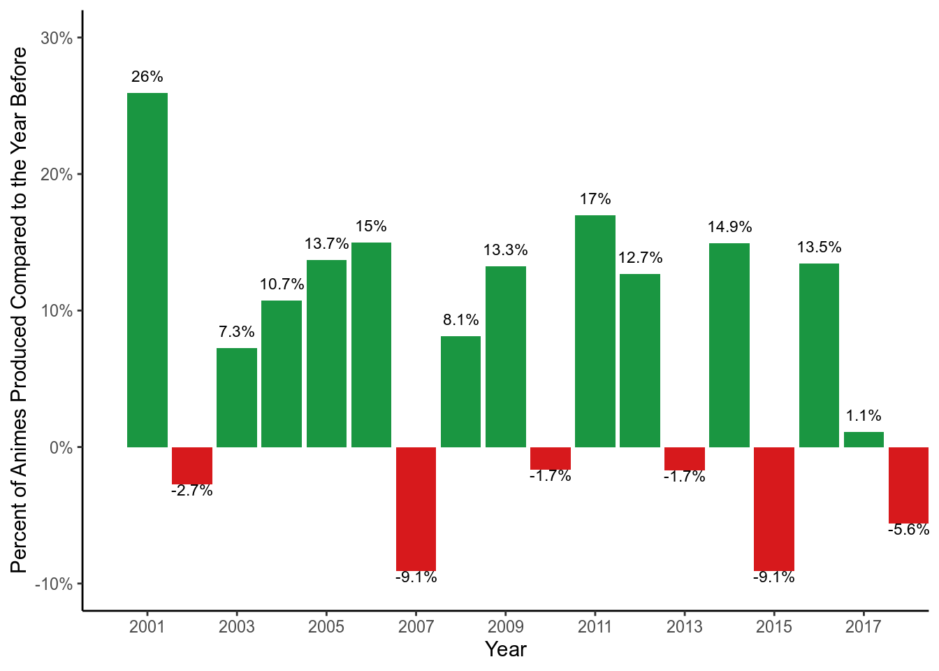
Rise in Anime Popularity
I guess I am not alone when it comes to getting hooked on anime shows. Since the start of the century, the number of anime shows produced has seen a large increase. Below we calculated the growth of the number of anime shows produced compared to the year before . Year 2001 saw the greatest increase in the number of shows produced compared to the year before (26%). On average, there has been an increase of 6.86% each year between 2000 and 2018.
How many of the top shows have I watched?
The three variables that we are looking at are popularity, fan favorites, and rank. There is a lot of overlap between these three categories. The popularity variable counts how many times a show is put on a MAL member’s personal watch list. However, it is unclear whether the lists include animes that members have already watched or plan to watch according to the data dictionary provided from TidyTuesday. Members are also able categorize which animes are their favorite, and the favorite variable counts this information. Lastly, members can give anime shows a score. MAL uses their own formula to give each anime a rank, which appears to be calculated from the average score given for each anime while accounting how many members took the time to give the anime a score.
Top 100 Ranked Anime Shows
There are over 13631 unique animes listed in the dataset so I am only going to take a look at the top 100. We will make a scatterplot to show the top 100 ranked anime shows based on the number of members that have the anime on their personal list and the number of members that have the anime as their favorite. I made the scatterplot dynamic and when you hover over each point, you will be see the actual count of popularity (members) and favorites, name of the anime, a rank based on popularity (popularity), a score given by MAL members, rank based on the the score(Rank), and whether the anime is still currently airing.
Surprisingly only one of the top 100 animes is still currently airing. What is more surprising is that the same anime has more than 800 episodes. I am curious to check it out but worried that if I like it there will be a never ending storyline.
I used the plotly package for the plot above to help provide readers with more information about the anime when you hover your mouse over each point, called the tooltip. This does not require a lot of extra code (code provided at the end of post) to make your ggplot more informative without cluttering your graph, but it is confusing the first time. There is a great resource for learning how to make interactive plots efficiently with plotly here.
I’ve watched only 4 of the top 20 ranked animes.
![]()
Top 20 Most Popular and Fan Favorite anime shows.
As far as the most popular and fan favorite, there is a lot of overlap. Many of the popular ones are also fan favorites of MAL members, but there are a few that are in one category but not the other.
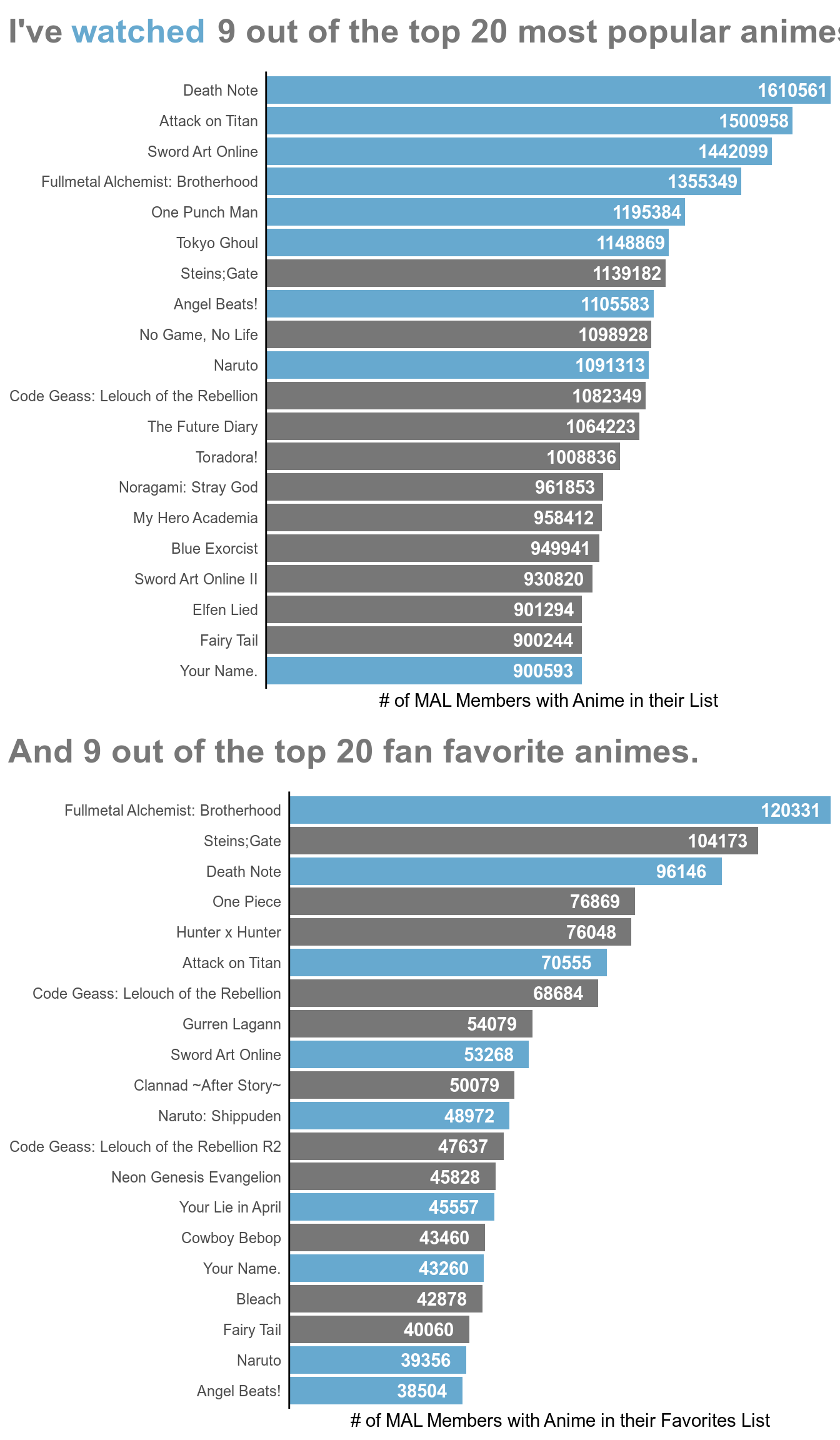
I have seen almost half of the top popular and favorite anime shows. There are definitely a few anime shows whose name I recognize from the lists above but I have yet to watch because they did not catch my interest when I would be browsing for animes to watch. However, maybe now I will give them a chance.
Code
Below is the code for everything in this post.
# Set up options for rmarkdown chunks
knitr::opts_chunk$set(warning = FALSE, message = FALSE, echo = FALSE, comment = "")
tidy_anime <- rio::import(here::here("static/datasets", "anime.rdata"))
# Load Data
tidy_anime <- readr::read_csv("https://raw.githubusercontent.com/rfordatascience/tidytuesday/master/data/2019/2019-04-23/tidy_anime.csv")
# Use read_html to read the underlying html structure and objects found on the page
page <- xml2::read_html("https://github.com/rfordatascience/tidytuesday/tree/master/data/2019/2019-04-23")

# Use html_table to pull all tables from page
dictionary <- rvest::html_table(page)

DT::datatable(dictionary[[2]],
              rownames = FALSE,
              options = list(dom = 'tp',
                             columnDefs = list(list(className = 'dt-left',
                                                    targets = 0:2))))
# Load Packages
library(tidyverse)
library(grid)
# ggplot of the number of animes produced over the years
production <- tidy_anime %>%
  distinct(animeID, .keep_all = TRUE) %>%
  mutate(Year = lubridate::year(start_date)) %>%
  ggplot() +
  stat_count(aes(Year), na.rm = TRUE) +
  scale_x_continuous(limits = c(1979, 2021), breaks = seq(1980, 2020, 5),
                     expand = c(0, 0)) +
  scale_y_continuous(name = "# of Animes Produced", expand = c(0, 0)) +
  theme_classic()

# Converting static ggplot into dynamic plotly graph. Wrapped it within a div
# tag using the htmltools to center it in my output.
htmltools::div(plotly::ggplotly(production), align = "center")
# ggplot demonstrating percentages of animes produced compared to the year
# before
production$data %>%
  count(Year) %>%
  filter(between(Year, 2000, 2018)) %>%
  mutate(Percent_Change = (n - lag(n)) / n) %>%
  mutate(Increase = ifelse(Percent_Change > 0, "Yes", "No")) %>%
  ggplot() +
  stat_identity(aes(Year, Percent_Change, fill = Increase), geom = "bar") +
  geom_text(aes(Year, Percent_Change, label = ifelse(Percent_Change > 0,
    paste(round(Percent_Change * 100, 1), "%", sep = ""), "")),
    vjust = -1, size = 3) +
  geom_text(aes(Year, Percent_Change, label = ifelse(Percent_Change < 0,
    paste(round(Percent_Change * 100, 1), "%", sep = ""), "")),
    vjust = 1, size = 3) +
  scale_x_continuous(breaks = seq(2001, 2019, 2), expand = c(0, 0)) +
  scale_y_continuous(
    name = "Percent of Animes Produced Compared to the Year Before",
    labels = scales::percent, limits = c(-.10, .30)) +
  scale_fill_manual(values = c("#d7191c", "#1a9641")) +
  theme_classic() +
  theme(legend.position = "none", )
# Interactive Plotly scatterplot of top 100 most popular animes with additional
# information in the tooltip when you hover over the point
pop_fav <- tidy_anime %>%
  distinct(animeID, .keep_all = TRUE) %>%
  select(1, 3, 12, 18, 20:24) %>%
  arrange(popularity) %>%
  slice(., 1:100) %>%
  ggplot() +
  geom_point(aes(members, favorites,
# Plotly automatically adds the x & y variables in their tooltip. I used the
# group, text, and color aesthetics from ggplot2 to add more.
# In the text aes(), I added "<br />" which simply means line break. That way
# the tooltip can fit on the screen and be easier to read, otherwise it would
# place all the information on one long horizontal line.
                 group = title_english,
                 text = str_c("Popularity: ", popularity, "<br />",
                              "Score: ", score, "<br />",
                              "Rank: ", rank, sep = ""),
                 color = status)) +
  labs(x = "# MAL Members with Anime in their List",
       y = "# MAL Members with Anime in their Favorites") +
  scale_x_continuous(labels = scales::comma) +
  scale_y_continuous(labels = scales::comma) +
  theme_classic() +
  theme(legend.position = "none")

# Centering plotly above in the output
htmltools::div(plotly::ggplotly(pop_fav), align="center")
# Plot of top 20 ranked animes
tidy_anime %>%
  distinct(animeID, .keep_all = TRUE) %>%
  select(1, 2:3, 6, 18, 20) %>%
  arrange(rank) %>%
  slice(., 1:20) %>%
  mutate(Name = ifelse(is.na(title_english), name, title_english),
         Watched = ifelse(animeID %in% c(5114, 32281, 199, 23273),
                          "Yes", "No")) %>%
  ggplot() +
  geom_point(aes(fct_reorder(Name, score), score, color = Watched),
             size = 12) +
  geom_text(aes(fct_reorder(Name, score), score, label = score),
            color = "white") +
  labs(x = "MAL Score") +
  scale_color_manual(values = c("#777777", "#67A9CF", "#777777")) +
  coord_flip() +
  theme_classic() +
  theme(panel.grid.major.y = element_line(color = "lightgrey"),
        axis.line = element_blank(),
        axis.text.x = element_blank(),
        axis.ticks = element_blank(),
        axis.title.y = element_blank(),
        legend.position = "none")
#Clean ggplot2 theme
clean_theme <- theme_classic() +
  theme(legend.position = "none", axis.line.x = element_blank(),
        axis.text.x = element_blank(), axis.ticks.y = element_blank(),
        axis.title.y = element_blank())

#Plot of top popular anime shows
pop <- tidy_anime %>%
  distinct(animeID, .keep_all = TRUE) %>%
  arrange(.$popularity) %>%
  slice(., 1:20) %>%
  mutate(Watched = ifelse(animeID %in% c(1535, 16498, 11757, 5114, 30276,
                                         22319, 6547, 20, 32281),
                          "Yes", "No")) %>%
  ggplot() +
  geom_bar(aes(fct_reorder(title_english, popularity, .desc = TRUE), members,
               fill = Watched), stat = "Identity") +
  scale_fill_manual(values = c("#777777", "#67A9CF")) +
  geom_text(aes(title_english, members, label = members),
            nudge_y = -110000, color = "white", fontface = "bold") +
  scale_y_discrete(name = "# of MAL Members with Anime in their List",
                   expand = c(0,0)) +
  coord_flip() +
  clean_theme

#Creating multicolor title for plot
pop_title <- grobTree(
  gp = gpar(fontsize = 20, fontface = "bold"),
  textGrob(label = "I've",
           name = "title1",
           x = unit(0.2, "lines"),
           y = unit(0.5, "lines"),
           hjust = 0, vjust = 0, gp = gpar(col = "#777777")),
  textGrob(label = "watched", name = "title2",
           x = grobWidth("title1") + unit(0.4, "lines"),
           y = unit(0.5, "lines"),
           hjust = 0, vjust = 0, gp = gpar(col = "#67a9cf")),
  textGrob(label = "9 out of the top 20 most popular animes.",
           name = "title3",
           x = grobWidth("title1") + grobWidth("title2") + unit(0.7, "lines"),
           y = unit(0.5, "lines"),
           hjust = 0, vjust = 0, gp = gpar(col = "#777777")))

#Arranging title on top of plot
grid_pop <- gridExtra::arrangeGrob(pop, top = pop_title,
                             padding = unit(2.6, "line"))

#Plot of top favorite anime shows
favs <- tidy_anime %>%
  distinct(animeID, .keep_all = TRUE) %>%
  arrange(desc(.$favorites)) %>%
  slice(., 1:20) %>%
  mutate(Watched = ifelse(animeID %in% c(5114, 1535, 16498, 11757, 1735, 23273,
                                         32281, 20, 6547), "Yes", "No")) %>%
  ggplot() +
  geom_bar(aes(fct_reorder(title_english, favorites, .desc = FALSE), favorites,
               fill = Watched), stat = "Identity") +
  scale_fill_manual(values = c("#777777", "#67A9CF")) +
  geom_text(aes(title_english, favorites, label = favorites),
            nudge_y = -9000, color = "white", fontface = "bold") +
  scale_y_discrete(
    name = "# of MAL Members with Anime in their Favorites List",
    expand = c(0,0)) +
  coord_flip() +
  clean_theme

#Creating multicolor title for plot
favs_title <- grobTree(
  gp = gpar(fontsize = 20, fontface = "bold"),
  textGrob(label = "And 9 out of the top 20 fan favorite animes.",
           name = "title1",
           x = unit(0.2, "lines"),
           y = unit(0.5, "lines"),
           hjust = 0, vjust = 0, gp = gpar(col = "#777777")))

#Arranging title on top of plot
grid_favs <- gridExtra::arrangeGrob(favs, top = favs_title,
                             padding = unit(2.6, "line"))

#Final Plot
watched <- gridExtra::arrangeGrob(grid_pop, grid_favs)
grid.draw(watched)