Data Visualization in R & Labels
I often treat building data visualizations in R as a fun puzzle. Prior to learning how to use ggplot2, I would do all of my graphs in excel. Making eye catching graphs in excel is often easier and quicker (especially if you follow Stephanie Evergreen). One feature that I really enjoy in excel is the ease of adding/removing data point labels and re-positioning them with a mouse to get them exactly where I want them, but excel is a tool designed by others for general use and has its own limitations. Therefore, being able to use ggplot2 expands the tools and resources I have available to make effective data visualizations.
However in R, adding and positioning specific labels is not as simple. One recent challenge I had was making a box plot with the mean, median, and interquartile points labeled. Making a box plot itself is not difficult through R, but adding the specific labels in a concise way is. The conventional way of adding labels in R is you first need to calculate these statistics separate from your process of building your ggplot. Once you have those calculations, you can then add them as layers to your plot. The process is as follows…
Generate Data for Box Plot
# Load tidyverse
library(tidyverse)

# Random Variables
x1 <- floor(runif(100, 1, 35))
x2 <- floor(runif(100, 1, 15))

# Data.frame
dat <- data.frame(x1, x2)

# Make it tidy data
dat <- dat %>%
  gather(key = "Variable", value = "Value")
Unlabeled Box Plot
blank_boxplot <- ggplot(dat, aes(x = Variable, y = Value)) +
  geom_boxplot(aes(color = Variable)) +
  scale_y_continuous(breaks = seq(0, 35, 5)) +
  scale_color_manual(values = c("#295D6E", "#FDA52E")) +
  coord_flip() +
  theme_classic() +
  theme(axis.line.y = element_blank(),
    axis.title.y = element_blank(),
    axis.text.y = element_blank(),
    axis.ticks.y = element_blank(),
    legend.position = "none")

blank_boxplot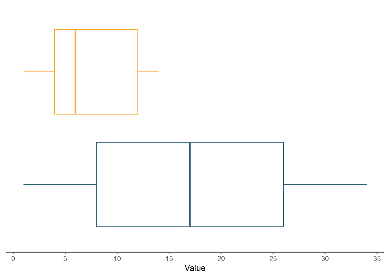
Calculate Statistics for Labels
Now we have to calculate the mean and quantiles from our data and then store them in their own data frames to reference when building our plots.
# Calculate means
mean <- dat %>%
  group_by(Variable) %>%
  summarise(Mean = mean(Value))

# Calculate quantiles
quants <- dat %>%
  group_by(Variable) %>%
  group_modify(~{quantile(.x$Value, probs = c(.25, .5, .75)) %>%
      tibble::enframe()})
Add the Mean Label
We have to reference the mean data frame we created earlier. I added two layers, a point geom to mark the mean and a text geom to label the mean.
box_withMean <- blank_boxplot +
  geom_point(data = mean, aes(Variable, Mean), shape = "cross") +
  geom_text(data = mean,
            aes(Variable, Mean, label = round((Mean), 1), hjust = -.2))
box_withMean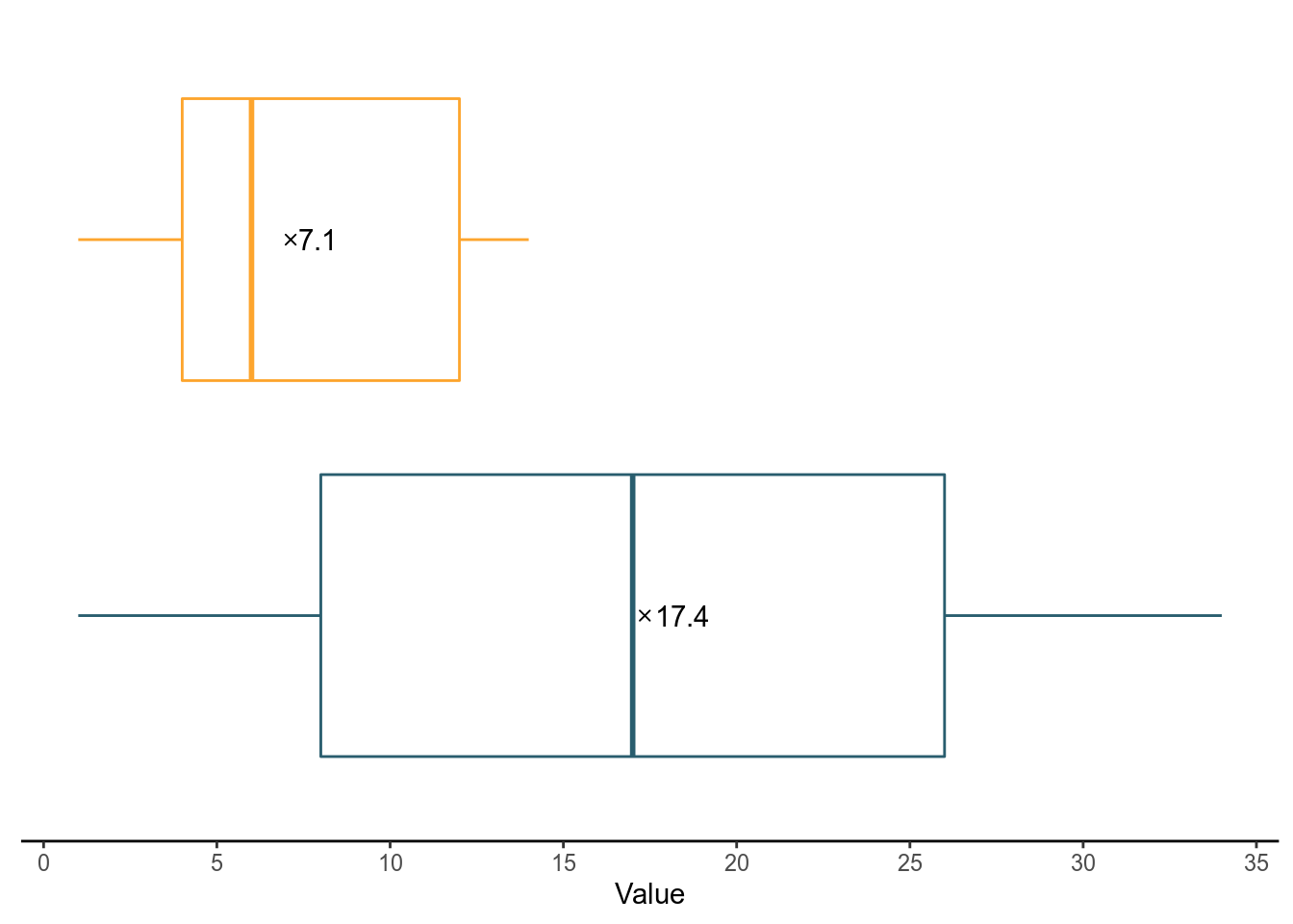
Add the Quantiles
Do the same with the quants data frame.
box_withMean +
  geom_text(data = quants,
            aes(Variable, value, label = round(value, 1), vjust = 8))
This process is cumbersome for me and I found another way get this done by taking advantage of ggplot2’s stat geoms.
Stat_ Geoms & Computed Variables
In ggplot2, there are are a few stat geoms that you can help you make statistical calculations inside the ggplot building process without having to create separate data frame objects. The bigger secret however is that you can even reference the calculations and use them to label points.
In reality it is not a secret, but I think ggplot2 does a terrible job of explaining this functionality in their documentation. Under some of their stat layers you will see a section with the heading Computed variables. There you will see a list of variables that you can use. For example under stat_boxplot you can use ymin, lower, middle, upper, etc.
The possibilities don’t end there. I also discovered you can reference your transformed aesthetic variables from the stat_ functions but ggplot2 references does not clearly mention this! I randomly stumbled upon this one time in StackOverflow but didn’t think much of it at the time. Now I am frustrated that this isn’t discussed as much because I honestly still don’t understand how or why they work. I also am not experienced enough to read the source code.
To call these variables you place them in between two periods (example: ..y..). I have also previously used ..count.. before to add labels for a total count of a stacked bar plot. I repeat, I do not fully understand how, why this works, or the possibilities from other stat_ geoms. I used this method to label my box plot in fewer steps than the code above. Notice i used ..y.. for my label.
Stat_Geoms & Stat Variables
blank_boxplot +
  stat_summary(inherit.aes = TRUE, fun.y = "mean", geom = "point",
               shape = "cross") + # Add Mean point
  stat_summary(fun.y = "mean", geom = "text",
               aes(label = round(..y.., 1), hjust = -.2)) + # Add mean label
  stat_summary(fun.y = function(z) {quantile(z, probs = c(.25, .5, .75))},
               geom = "text", aes(label = ..y.., vjust = 8)) # Add IQR labels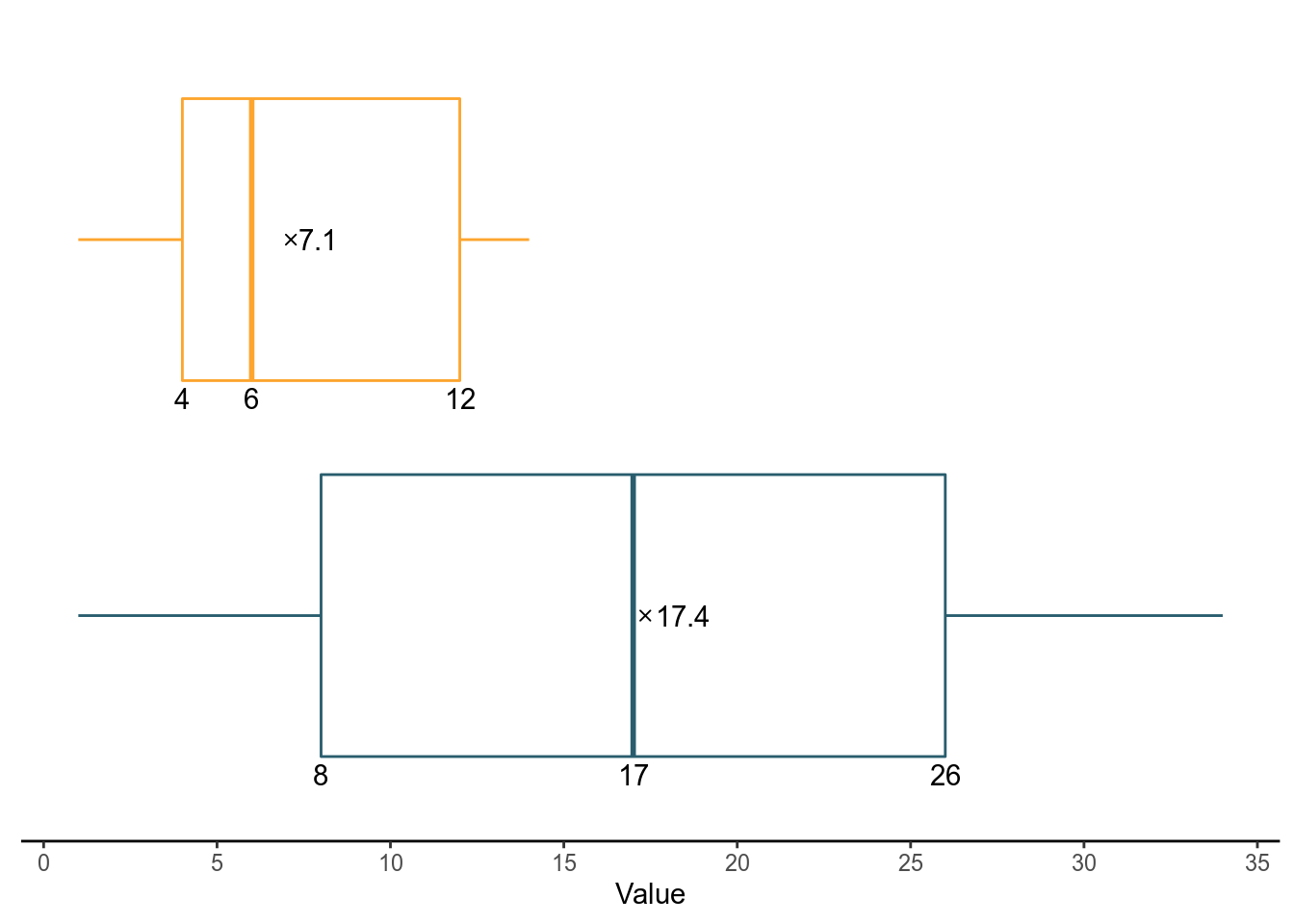
In the end, this is a lot more concise. It is also a handy trick to know and my only wish is that the ggplot2 documentation can explain this. I will definitely be referencing this in future plots until ggplot2 decides to do something about this more.